Industry
EdTech
Scope
Product Design, Design System, Design Tokens
Rebuilding the Pencil Design System for a Scalable, AI-Driven Future

Industry
EdTech
Scope
Product Design, Design System, Design Tokens
Rebuilding the Pencil Design System for a Scalable, AI-Driven Future
Industry
EdTech
Scope
Product Design, Design System, Design Tokens
Rebuilding the Pencil Design System for a Scalable, AI-Driven Future
Redefining a design system to match the pace of innovation
In the age of AI, with technologies like ChatGPT, Midjourney and Gemini redefining UX and interface design, the Pencil design system — widely recognized and used within the industry — was in need of a thorough modernization.
As the initiator and leader of the system analysis, I conducted a full audit, designed the roadmap for change (Colors, Tokens, Grid & Spacing, Typography), implemented a new governance flow, and introduced tools like Figma Variables and Code Connect.
Pencil was a key part of Brainly’s design infrastructure — used by dozens of design and development teams. Its modernization improved work velocity, interface consistency, and made the system scalable during a period of rapid visual and brand transformation.
This is Pencil
.
The Pencil Design System was an extensive, open-source system crafted to enhance user experiences across Brainly’s platform. It provided a centralized hub of design assets and documentation for dozens of teams, including product, marketing, and engineering.
Below is a breakdown of how the design system was structured and how my work focused on foundational elements to enable future growth.
Foundations
Typography, Icons, Colors, Grid & Spacing…
Web app
Components
/
Mobile App
Components
/
Utilities
Utilities for design
Components
Buttons, Inputs, Checkbox…
/
Organisms
Modals, Cards, Notification…
/
Pages
Homepage, QP, Signup Flow…
Spec files
Pixel perfect + dev Handoff designs
Goals
.
The primary goals were to transform the legacy system into a modern, scalable foundation for future product innovation.
Goals
.
The primary goals were to transform the legacy system into a modern, scalable foundation for future product innovation.
Goals
.
The primary goals were to transform the legacy system into a modern, scalable foundation for future product innovation.
Increase Velocity
Ensure consistency
Enable scalability
Boost adoption
Process
.
I identified the company's rebranding as the perfect opportunity to introduce fundamental changes. Knowing this would require significant resources, I first secured buy-in from my manager by presenting my hypothesis and a preliminary action plan.
After getting the green light, I conducted a series of interviews with designers, developers, and QA testers to validate my assumptions and build a strong business case.
Audit
Governance
Design Tokens
Components
Adoption
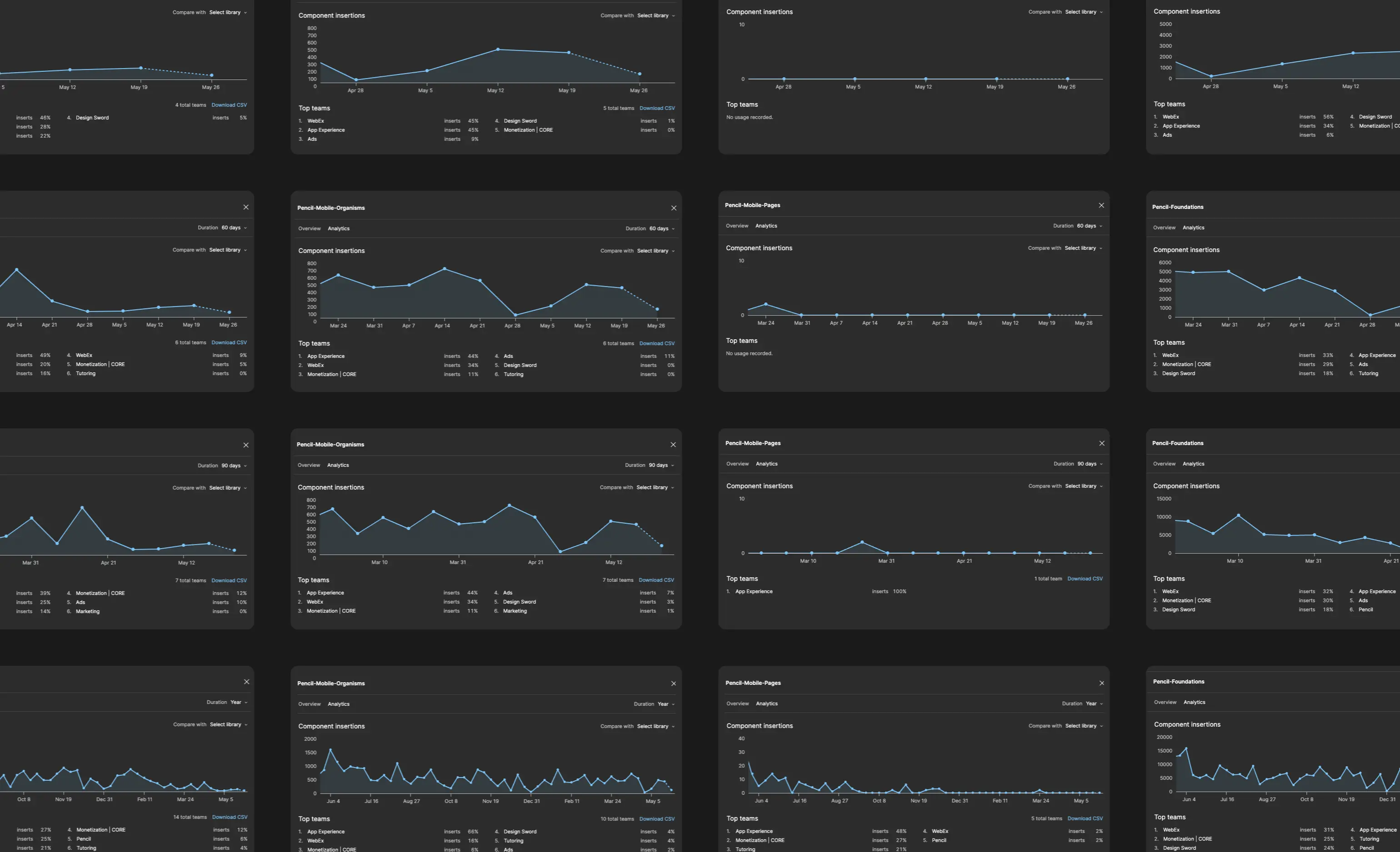
Design Audit
The first major step was a comprehensive audit of the entire system. I analyzed Figma Analytics to understand how existing components were being used and identified key pain points. I consolidated all design assets from Figma, Storybook, and Zeroheight into a single Design Inventory to expose inconsistencies.
This process not only gave me a clear picture of the problem's scale but also helped me define the scope and timeline for the rebuild.
Design Audit
.
The first major step was a comprehensive audit of the entire system. I analyzed Figma Analytics to understand how existing components were being used and identified key pain points. I consolidated all design assets from Figma, Storybook, and Zeroheight into a single Design Inventory to expose inconsistencies.
This process not only gave me a clear picture of the problem's scale but also helped me define the scope and timeline for the rebuild.
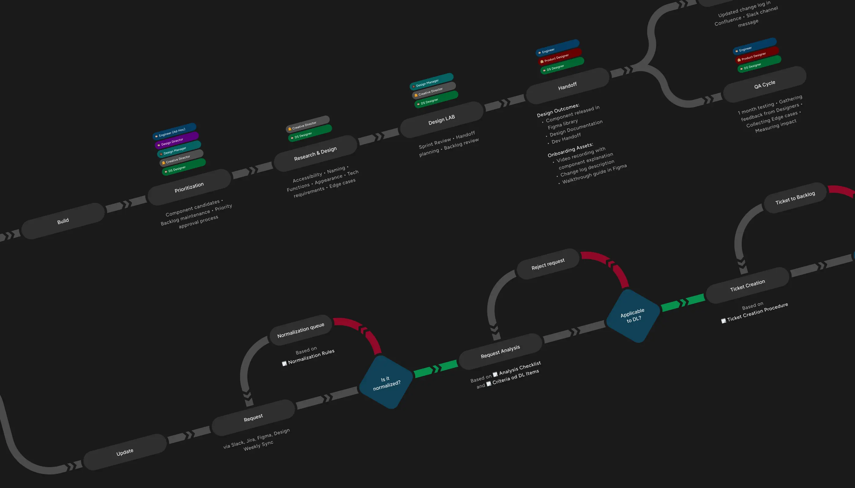
Governance Process
The audit confirmed that the existing governance processes were outdated and no longer functional. While awaiting the new brand book, I focused on redesigning the governance flow.
The new process was tailored to our current organizational structure, making it leaner, more flexible, and easier for teams to adopt. This was a crucial step in ensuring the long-term sustainability of the system.
Governance Process
.
The audit confirmed that the existing governance processes were outdated and no longer functional. While awaiting the new brand book, I focused on redesigning the governance flow.
The new process was tailored to our current organizational structure, making it leaner, more flexible, and easier for teams to adopt. This was a crucial step in ensuring the long-term sustainability of the system.
Design Tokens
.
I immediately recognized the potential of Figma Variables and planned to integrate it into the rebuild from the start, as it offered a new way to manage design tokens for colors, spacing, and typography.
Design Tokens
.
I immediately recognized the potential of Figma Variables and planned to integrate it into the rebuild from the start, as it offered a new way to manage design tokens for colors, spacing, and typography.
Design Tokens
.
I immediately recognized the potential of Figma Variables and planned to integrate it into the rebuild from the start, as it offered a new way to manage design tokens for colors, spacing, and typography.
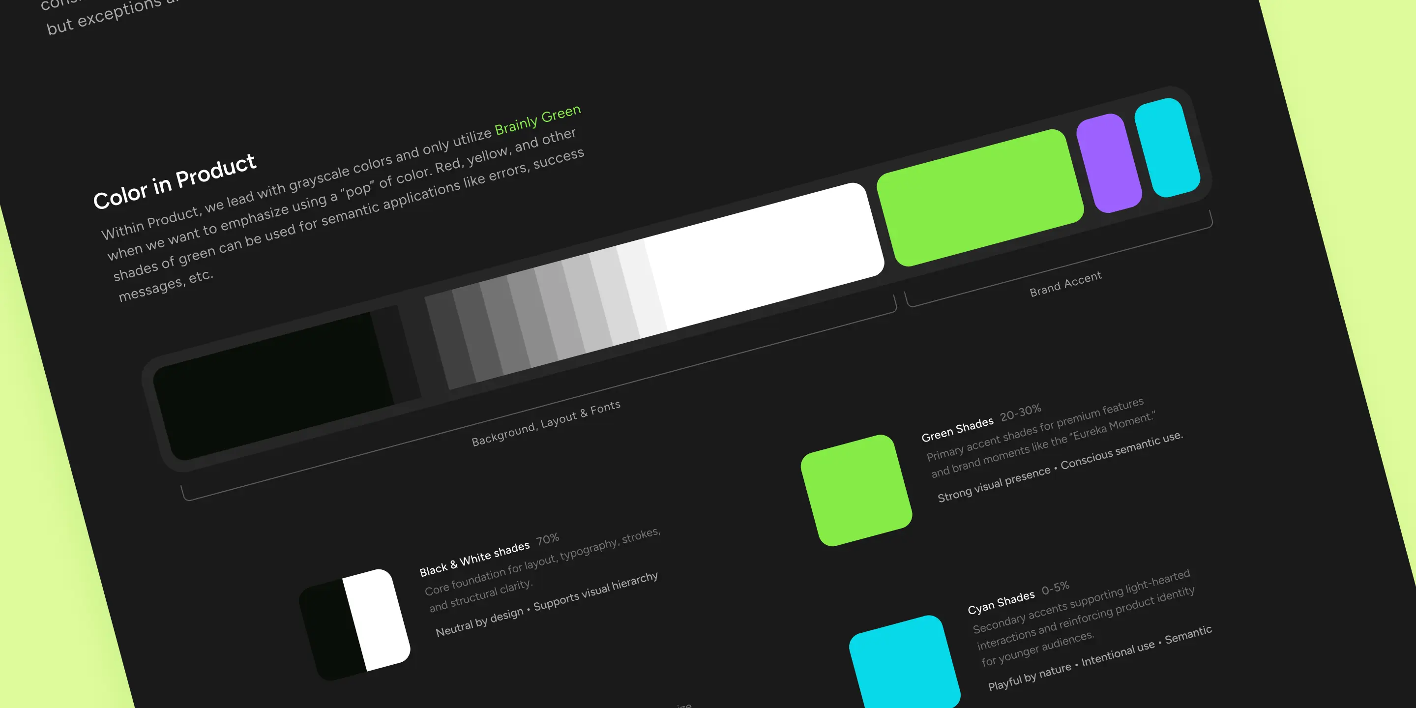
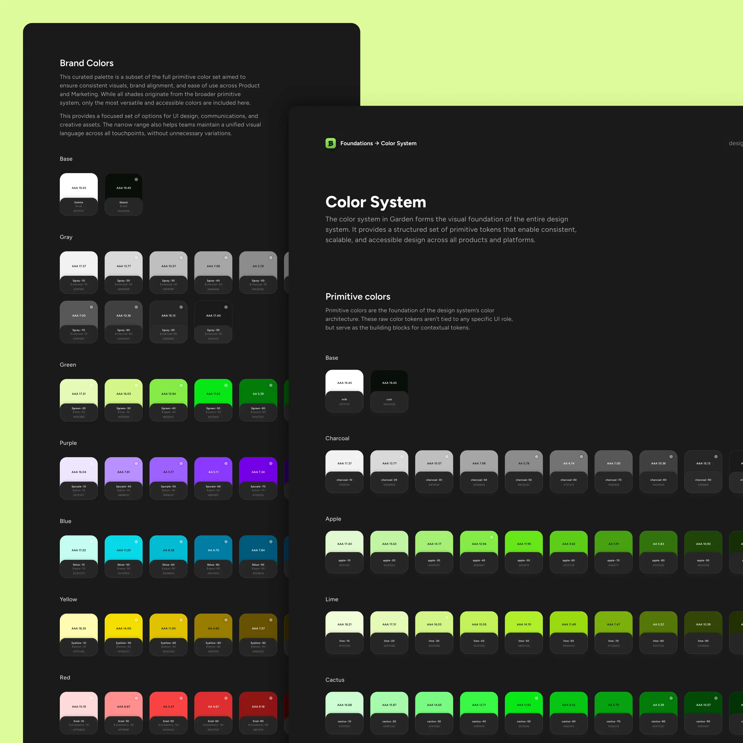
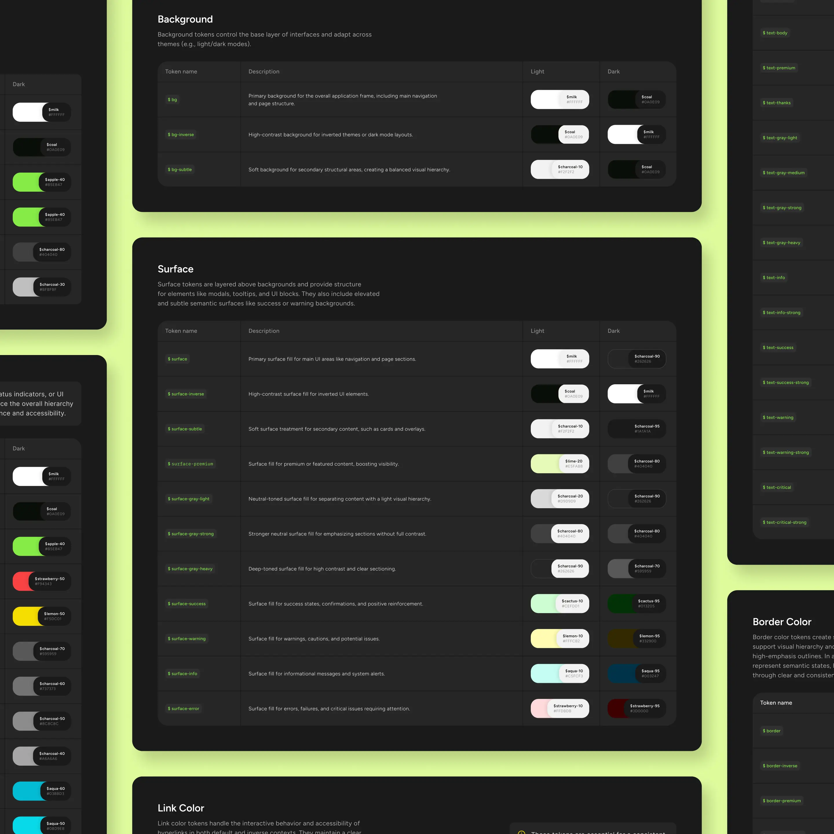
Color Tokens
The new brand book's color palette presented a challenge, as the provided shades were too far apart to support accessible UI states. To solve this, I created an expanded "primitives" palette with 10-level scales for all core hues. I then structured the color tokens semantically into 8 categories, including Background, Surface, Text Color, and Brand Colors.
This approach provided a clear structure while allowing for creative flexibility.
Color Tokens
.
The new brand book's color palette presented a challenge, as the provided shades were too far apart to support accessible UI states. To solve this, I created an expanded "primitives" palette with 10-level scales for all core hues. I then structured the color tokens semantically into 8 categories, including Background, Surface, Text Color, and Brand Colors.
This approach provided a clear structure while allowing for creative flexibility.
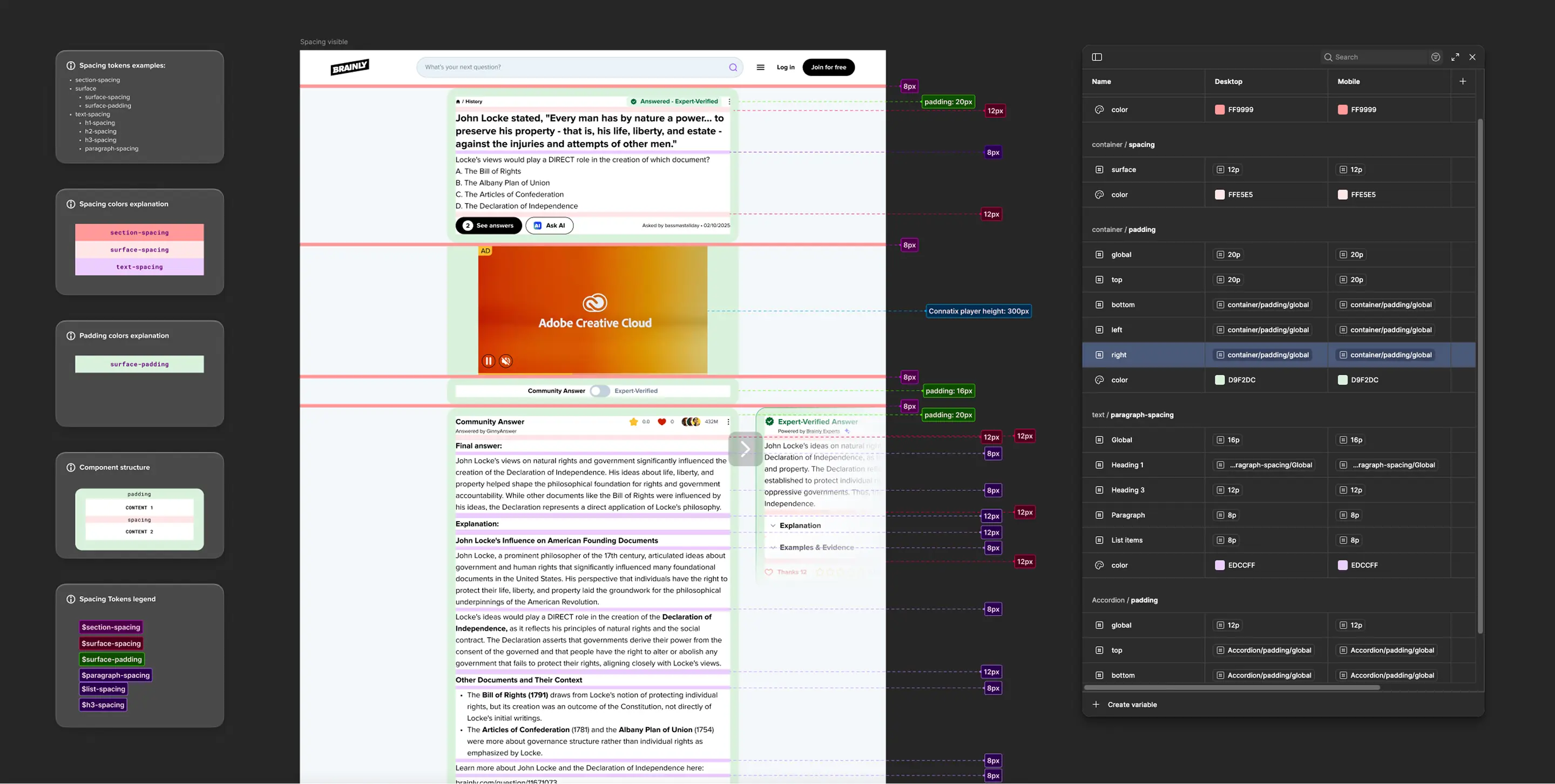
Grid & Spacing
I redefined the base grid from 8px to a more flexible 4px, which improved hierarchy and visual rhythm.
After analyzing inconsistencies in spacing across products, I created a Proof of Concept using Figma tokens to demonstrate how spacing could be standardized.
This was met with enthusiasm and added to the roadmap for future implementation.
Grid & Spacing
.
I redefined the base grid from 8px to a more flexible 4px, which improved hierarchy and visual rhythm.
After analyzing inconsistencies in spacing across products, I created a Proof of Concept using Figma tokens to demonstrate how spacing could be standardized.
This was met with enthusiasm and added to the roadmap for future implementation.
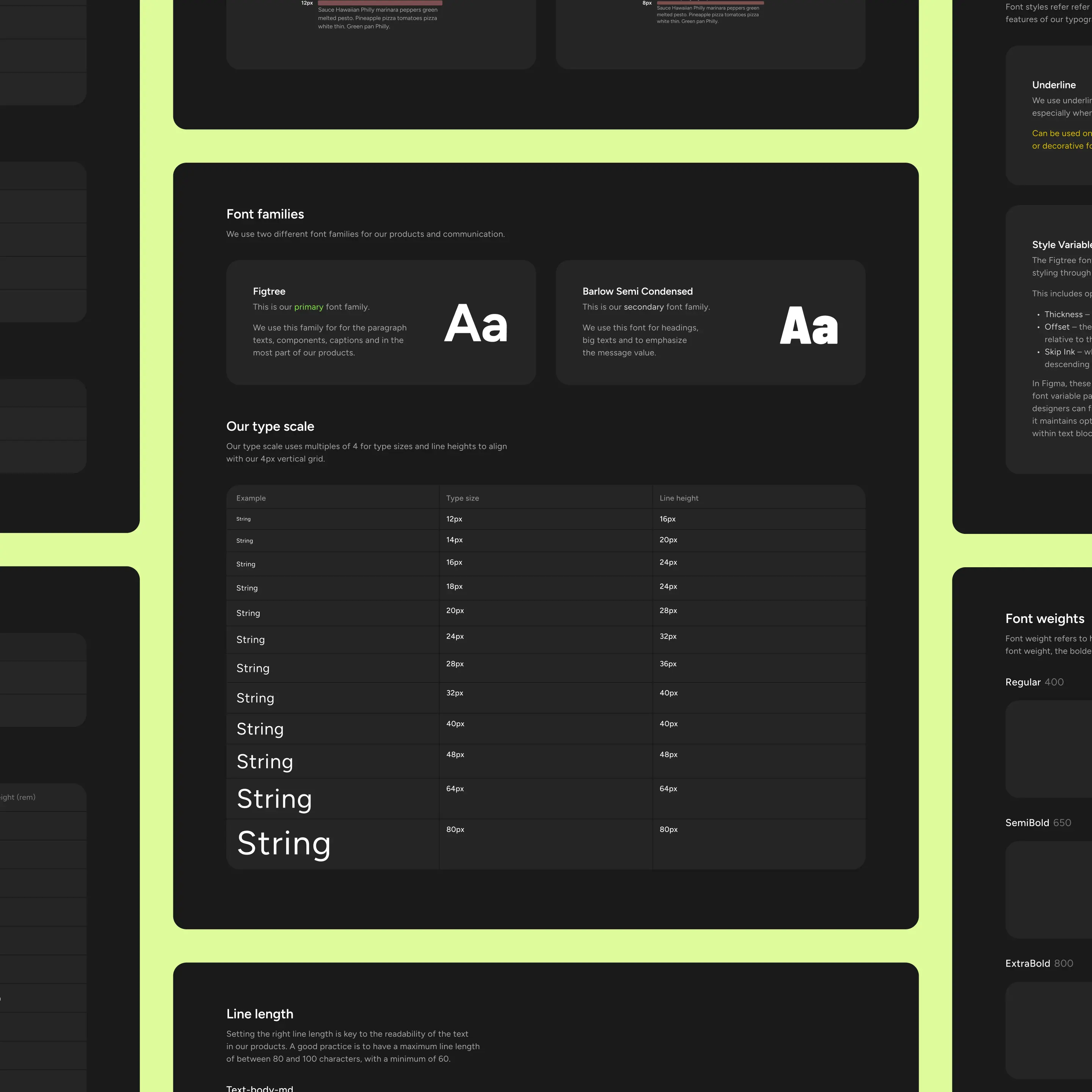
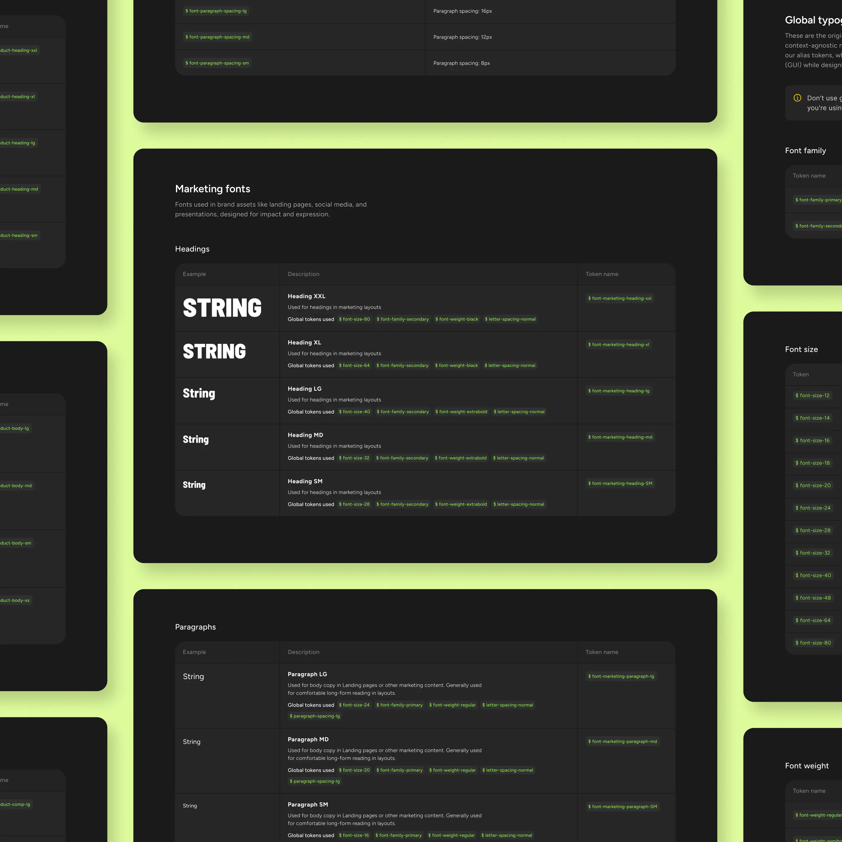
Typography
I defined a comprehensive typography set for both digital products and marketing needs.
The typography tokens were split into two levels:
Global Tokens(font family, size, weight, letter spacing…)Alias Tokens(Heading XXL, Heading XL, Body L, Comp…) with separate variants for mobile and desktop.
This structure allowed the system to adapt responsively without needing separate components.
Typography
.
I defined a comprehensive typography set for both digital products and marketing needs.
The typography tokens were split into two levels:
Global Tokens(font family, size, weight, letter spacing…)Alias Tokens(Heading XXL, Heading XL, Body L, Comp…) with separate variants for mobile and desktop.
This structure allowed the system to adapt responsively without needing separate components.
Code Connect
.
I explored a new opportunity to improve the design-development workflow by creating a Proof of Concept for Figma Code Connect. I demonstrated how design components could be mapped to production code, allowing developers to see ready-to-use code snippets directly in Figma's Dev Mode.
I secured strong buy-in from both product managers and engineers. The VP of Engineering supported me in prioritizing this work on the development roadmap.
Button.figma.tsx
import { Button } from "brainly-style-guide"

figma.connect(
  Button,
  'https://www.figma.com/design/...',
  {
    props: {
      buttonBase: figma.nestedProps('_button-base', {
        size: figma.enum('size', {
          LG: 'l',
          MD: 'm',
          SM: 's',
        }),
        reversedOrder: figma.enum('icon', {
          'no-icon': false,
          'left-icon': false,
          ...
Components library
.
With the foundational elements in place, I moved on to designing the first components.
Components library
.
With the foundational elements in place, I moved on to designing the first components.
Components library
.
With the foundational elements in place, I moved on to designing the first components.
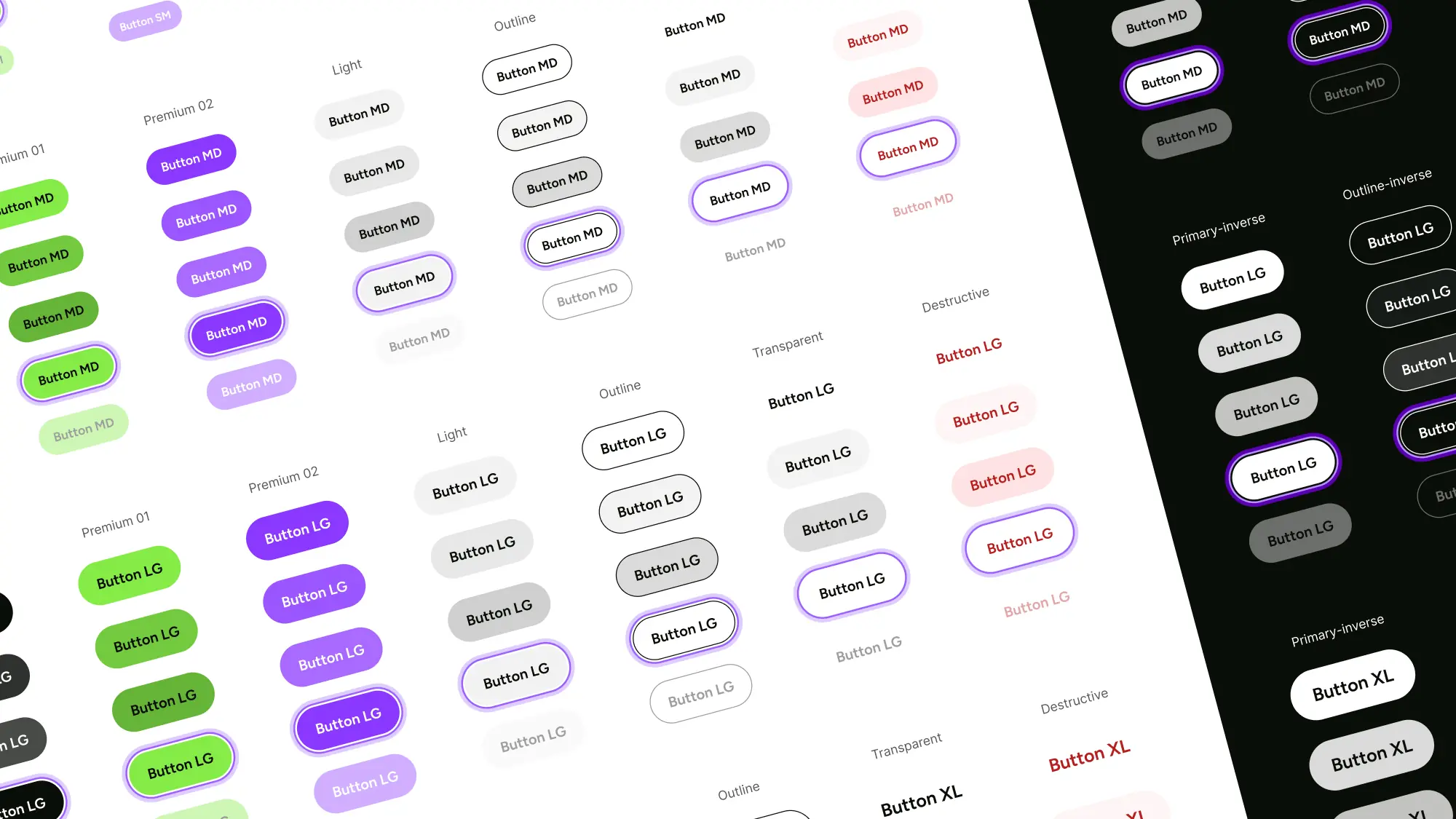
Buttons
Buttons were the first component I designed in the new system due to their high visibility and frequent use. I created a complete set of buttons, including semantic variants, usage priorities, and states (hover, focus, disabled).
All designs were aligned with the new color tokens and corner shapes, making the button system a robust part of the new UI library.
Buttons
.
Buttons were the first component I designed in the new system due to their high visibility and frequent use. I created a complete set of buttons, including semantic variants, usage priorities, and states (hover, focus, disabled).
All designs were aligned with the new color tokens and corner shapes, making the button system a robust part of the new UI library.
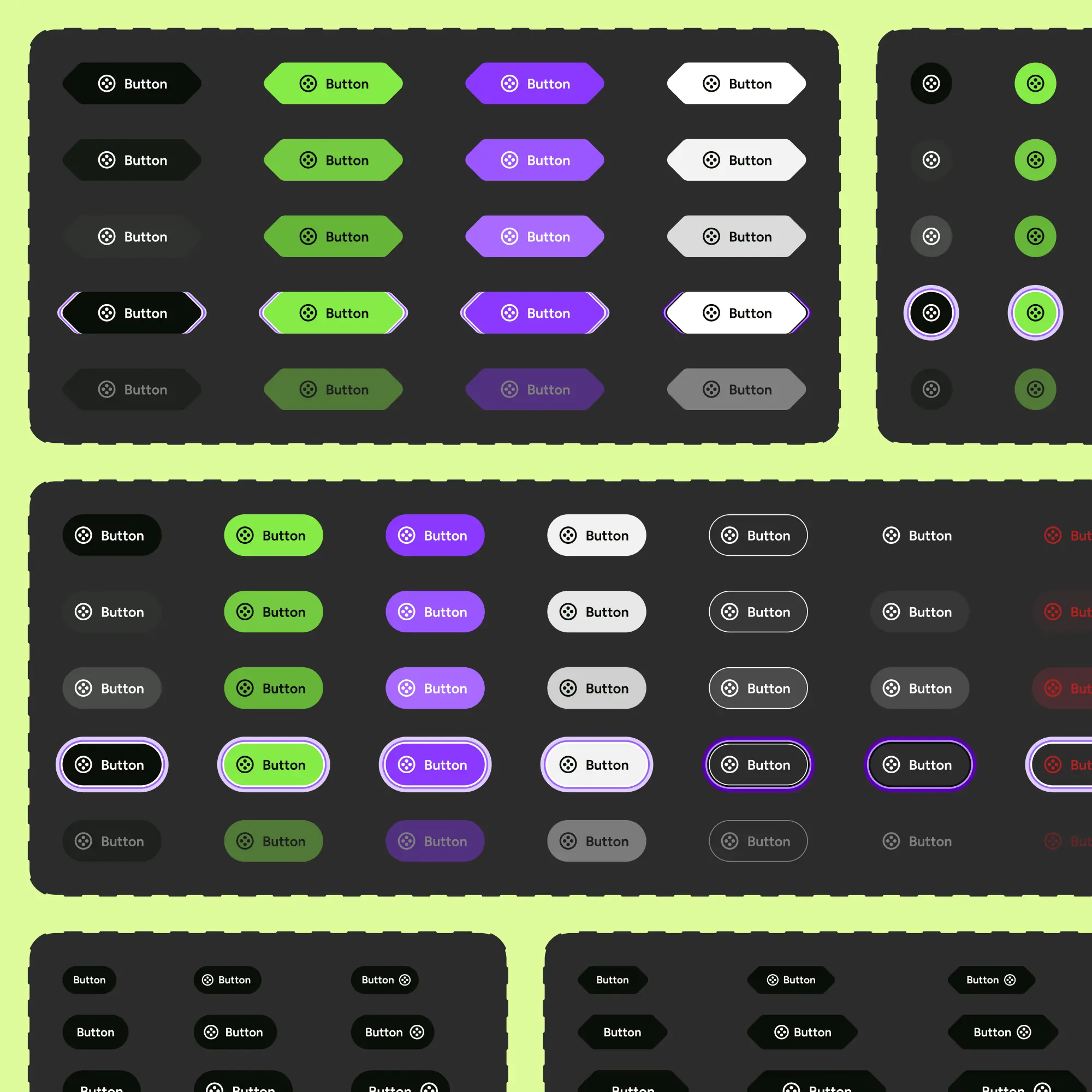
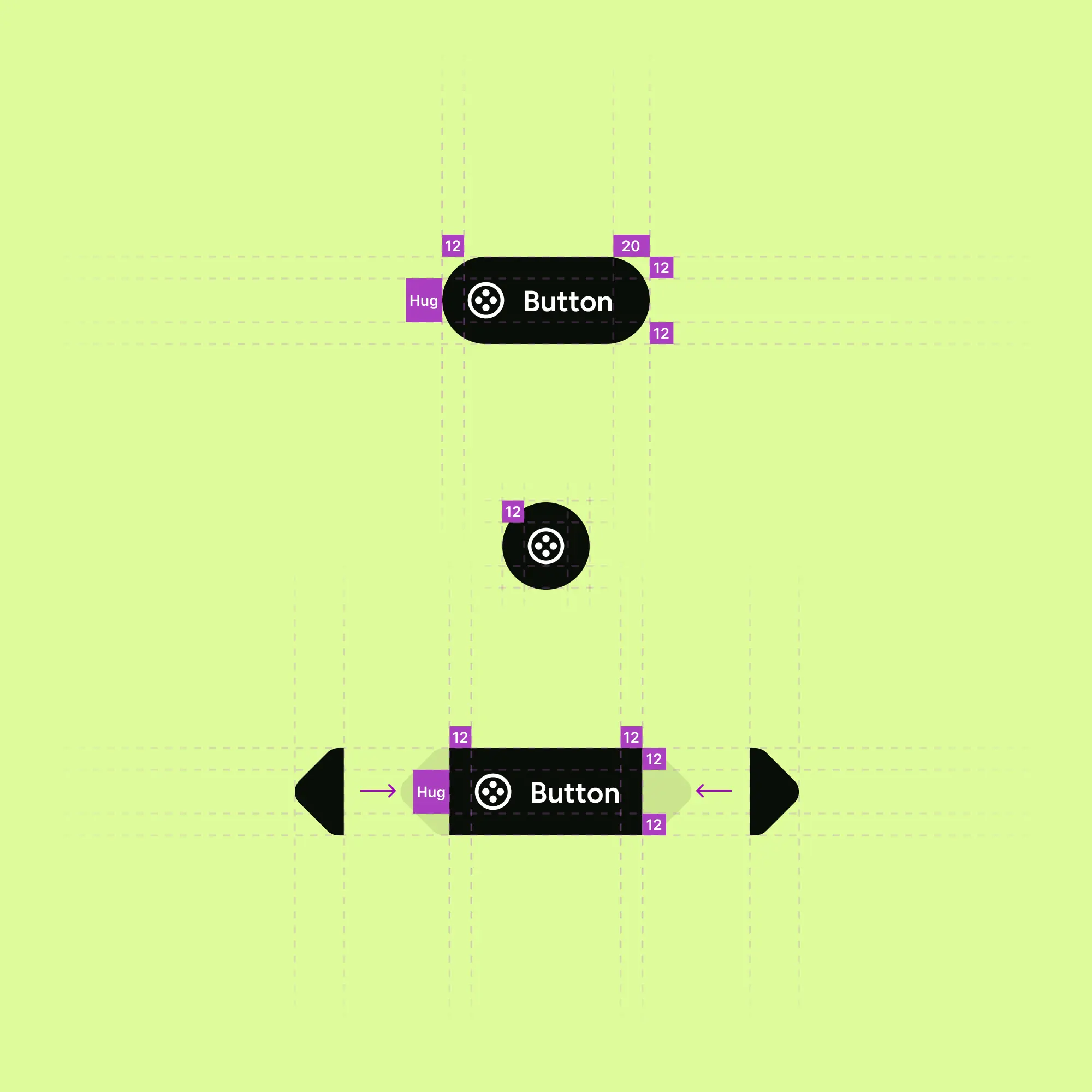
Corner Box
The new brand book featured a distinctive visual element: clipped, rounded corners. I tackled the challenge of making this feature responsive and accessible by designing a component in Figma that aligned with technical constraints.
This accelerated design work and improved development speed.
Corner Box
.
The new brand book featured a distinctive visual element: clipped, rounded corners. I tackled the challenge of making this feature responsive and accessible by designing a component in Figma that aligned with technical constraints.
This accelerated design work and improved development speed.
Outcomes
.
Design Efficiency
Dark mode design time was reduced by roughly 75%using Figma Variables.Component
iteration speed doubledthrough token reuse.The new system was adopted by stakeholders and became a core part of the product strategy.
Project Impact
Provided a scalable foundation for a major rebrand and future AI product development.
Improved collaboration and satisfaction within design and engineering teams, with over
80% reporting positive feedback.Demonstrated leadership in initiating and executing a project that delivered measurable organizational value.
Lesson
.
The transformation of the Pencil system was a significant journey that deepened my understanding of design leadership. It taught me that effective systems thinking is rooted in listening and empathy, as the primary obstacles were not visual, but procedural—tied to outdated governance and a lack of clear ownership.
I recognized that the true value of a system lies not just in its components, but in the strong processes and principles that underpin it. While new solutions like Figma Variables and Code Connect were powerful accelerators, they only became valuable because I built a solid strategic foundation and workflow around them.
Ultimately, this project was a testament to the power of initiative. I took the lead, scoped the work, and championed the changes, proving that proactive leadership can generate significant and lasting organizational impact.


